Designing a brand’s visual identity is a complex and challenging task. The goal is to convey the brand’s essence and values in an image that is easily recognizable and memorable. In the case of Joyero, a Colombian jewelry brand, Mr Urbina’s design team had the challenge of capturing the essence of the brand and translating it into a new visual identity.
The first step in the design process was an interview with the brand’s owners. The objective was to understand their vision and values, and how they wanted the brand to be perceived in the Colombian jewelry market. During the interview, details were discussed about the quality and exclusivity of Joyero’s jewelry pieces, as well as the sophistication and elegance of their design.
With this information, Mr Urbina’s design team began working on the brand’s logo and icon. The goal was to create a visual identity that reflected Joyero’s quality, exclusivity, and elegance.
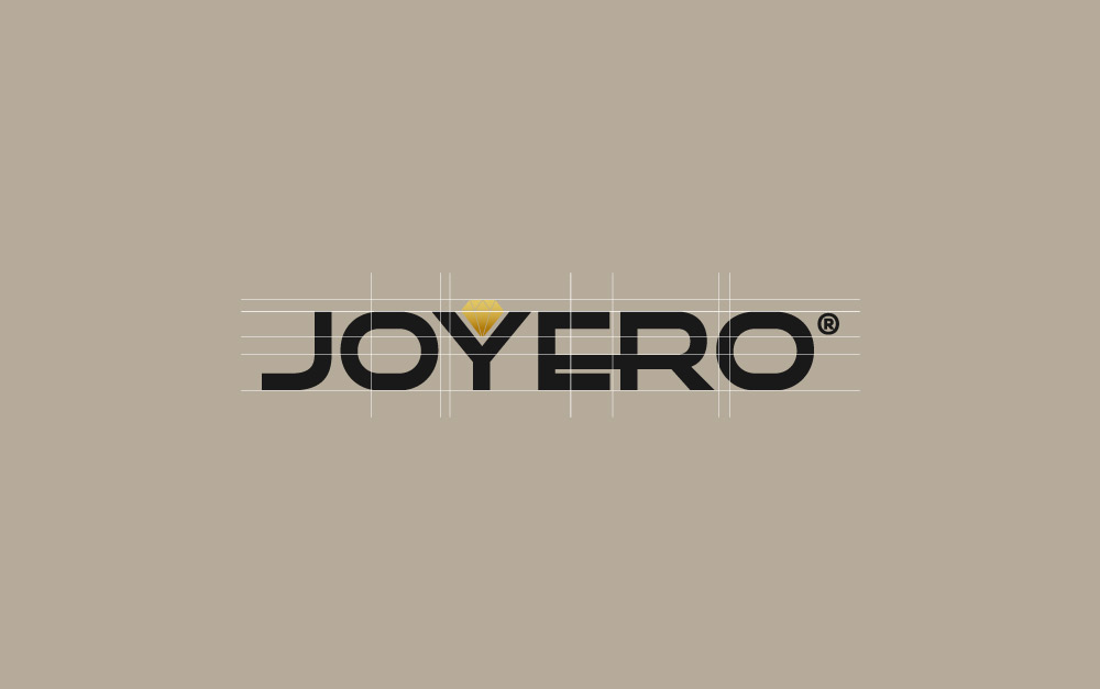
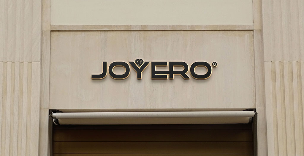
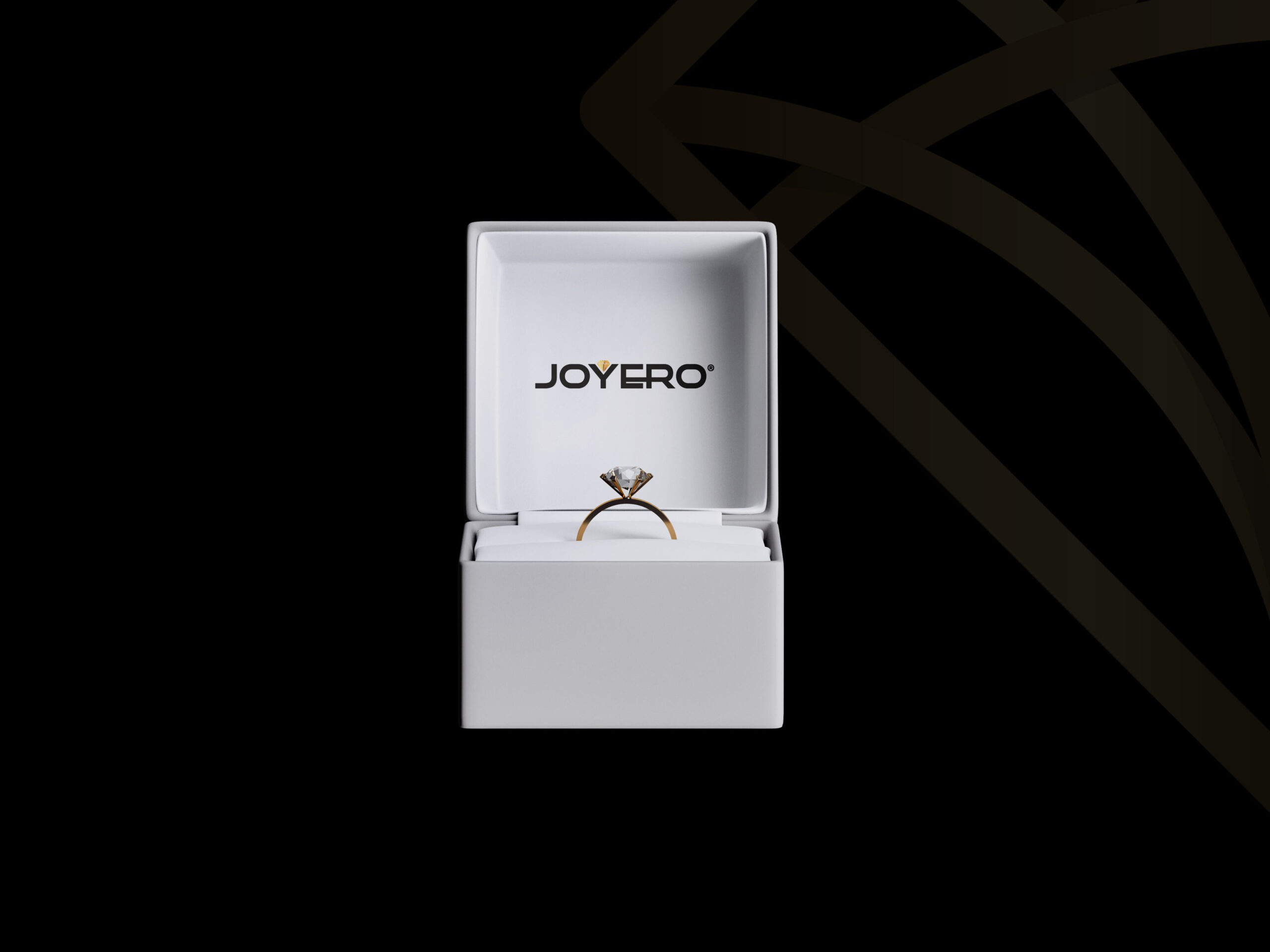
The final result was a logo that presents the word “Joyero” in an elegant and sophisticated font, with a diamond icon embedded in the letter Y. The diamond is an iconic symbol of jewelry, and it fit perfectly with the brand’s vision. By embedding the diamond in the “Y” of the logo, Mr Urbina’s design team visually conveyed the importance and centrality of jewelry in the Joyero brand.
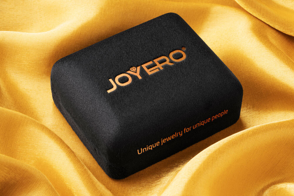
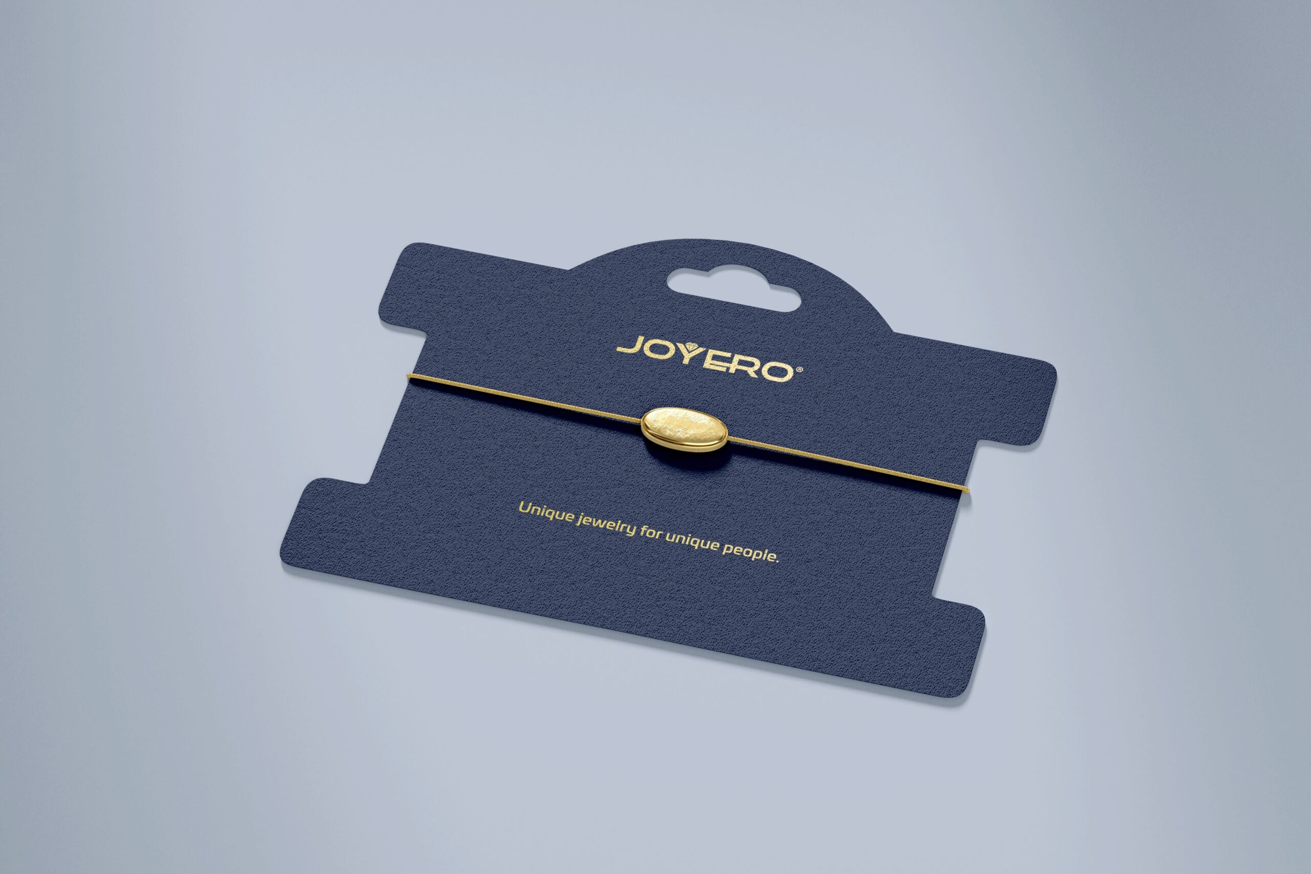
The choice of an elegant and sophisticated font also contributed to conveying the brand’s values. The font was carefully selected to ensure that it conveyed a sense of quality and refinement. In addition, the use of a gold color gave the logo a luxurious and sophisticated look.
The process of designing Joyero’s visual identity was a success thanks to the dedication and professionalism of Mr Urbina’s design team. They captured the essence of the brand and translated its values into a visual identity that reflects the brand’s elegance and sophistication. The final result is a valuable tool for the brand’s success in the Colombian jewelry market.
In conclusion, the design of Joyero’s visual identity was a collaborative process between Mr Urbina’s design team and the brand’s owners. The initial interview with the brand’s owners allowed the design team to understand the brand’s vision and values, and use that information to create an effective visual identity. The logo and icon designed by Mr Urbina reflect Joyero’s quality, exclusivity, and elegance, and will undoubtedly be a key element for the brand’s success in the Colombian jewelry market.