Groen is an emerging brand in Ecuador dedicated to the distribution of organic consumer goods. Our team had the honor of designing their corporate identity, reflecting their commitment to sustainability and healthy living.
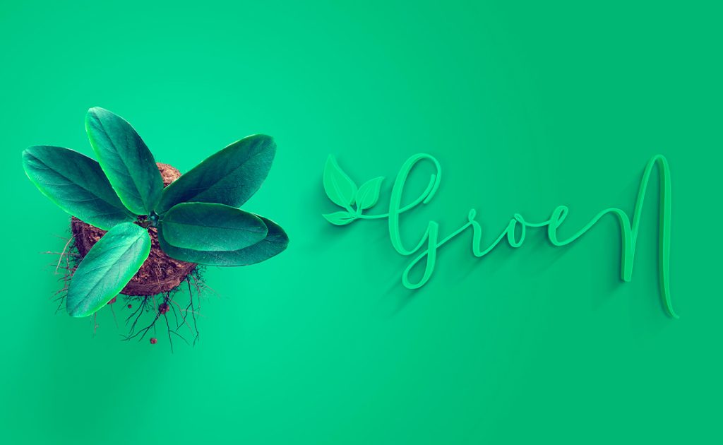
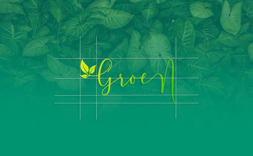
The Groen logo is a visual representation of their ecological mission. We incorporated natural elements like leaves to symbolize the brand’s organic and sustainable focus. The elegant, flowing typography in green tones conveys freshness and vitality, perfectly aligning with the brand’s values.
We opted for a palette of greens and yellows, evoking nature and the purity of organic products. These colors not only represent the brand but also create a sense of well-being and trust among consumers.
The typography chosen for Groen is modern and organic, ensuring excellent readability and a contemporary appearance. The cursive style adds a personal and welcoming touch, making the brand feel accessible and friendly.
We developed a variety of applications for Groen’s corporate identity. This includes stationery materials like business cards, letterheads, and envelopes, as well as social media templates and graphic elements for their website. Each element was designed to maintain visual consistency and reinforce the brand’s presence at all customer touchpoints.

The development of Groen’s corporate identity has resulted in a brand image that clearly communicates its values of sustainability, health, and quality. The new identity has been well-received and has helped establish a strong and positive connection with consumers.
With this identity, Groen is well-positioned to lead the organic products market in Ecuador, promoting a healthier lifestyle and a greener future.


